Wake Up a Room With a Top-Off of Coffee Color

By Carleton Varney- Special to the Palm Beach Daily News
These days, it seems, every street corner has a coffee place, whether it’s a Dunkin’, a Starbucks or some other brand. And so it is in the terminals of airports, where coffee seems to be available everywhere, day or night.
I have been a coffee fan for years — but not to drink. I love coffee ice cream, you see. It was my dad’s favorite, along with rum raisin, and I’ll say the coffee bean doesn’t fall far from the tree.
In today’s decorating world, where the minimalists desire little color other than beige and gray, a coffee shop may be just the answer.
As I sometimes do when I’m in the Dunkin’ drive-through on South Dixie Highway in West Palm Beach, I note the colors of the shop’s door handles — they’re tangerine orange and hibiscus pink. Those handles inspire me to envision a decorating scheme for a living room with Dunkin’ in mind. Now you may think I’ve gone, well, a bit batty. But everywhere I go I find inspiration for design.
Let us start by painting the living room walls café au lait, a warm color that mixes dark coffee with plenty of cream. In this color scheme, you’ll want to paint all the woodwork and trim a fresh white — think of whipped cream. Semi-gloss enamel is my choice.
At the windows, follow the Dunkin’ colors, but a bit paler: Hang roman shades made of fabric with a narrow stripe of soft pink and white. The shades should be lined in white so that the outside view of your windows isn’t jarring. Save the surprises for inside.
For your sofa upholstery, select a fabric with a traditional Thai print, one that might mix oranges, pinks, lettuce greens and white. Accent the sofa with Thai silk pinks and orange cushions. Then go Dunkin’ orange for the seats of your pull-up chairs.
Continue these bright-and-happy colors with orange-lacquered end tables topped by lamps with rattan bases and shades that have a raffia texture.
On the floor, place a rug woven of natural grass or sisal. You might consider laying a black-and-white faux zebra skin on top. A coffee table fashioned of clear acrylic would provide see-through appeal. And on the coffee table, a bowl of orange lilies in a glass vase would be lovely.
I know this sounds like a lot of bright color. But remember, the walls are a light coffee color and will provide a soothing background to please any minimalist.
Also be aware that the café au lait look works well with New England-style furnishings in deep leaf greens and soft daisy yellows. And those of us who love the South Florida seashore might try café au lait walls in rooms filled with furnishings and accessories of skipper blue, bright white and apple green.
Coffee is an American winner — as a drink, as an ice cream flavor and as a wall color that can work in just about any room of your home.
- Tags: carleton varney coffee color schemes decorating design inspiration finding inspiration ice cream interior design
2 comments
-
Lana Rae Higgins on
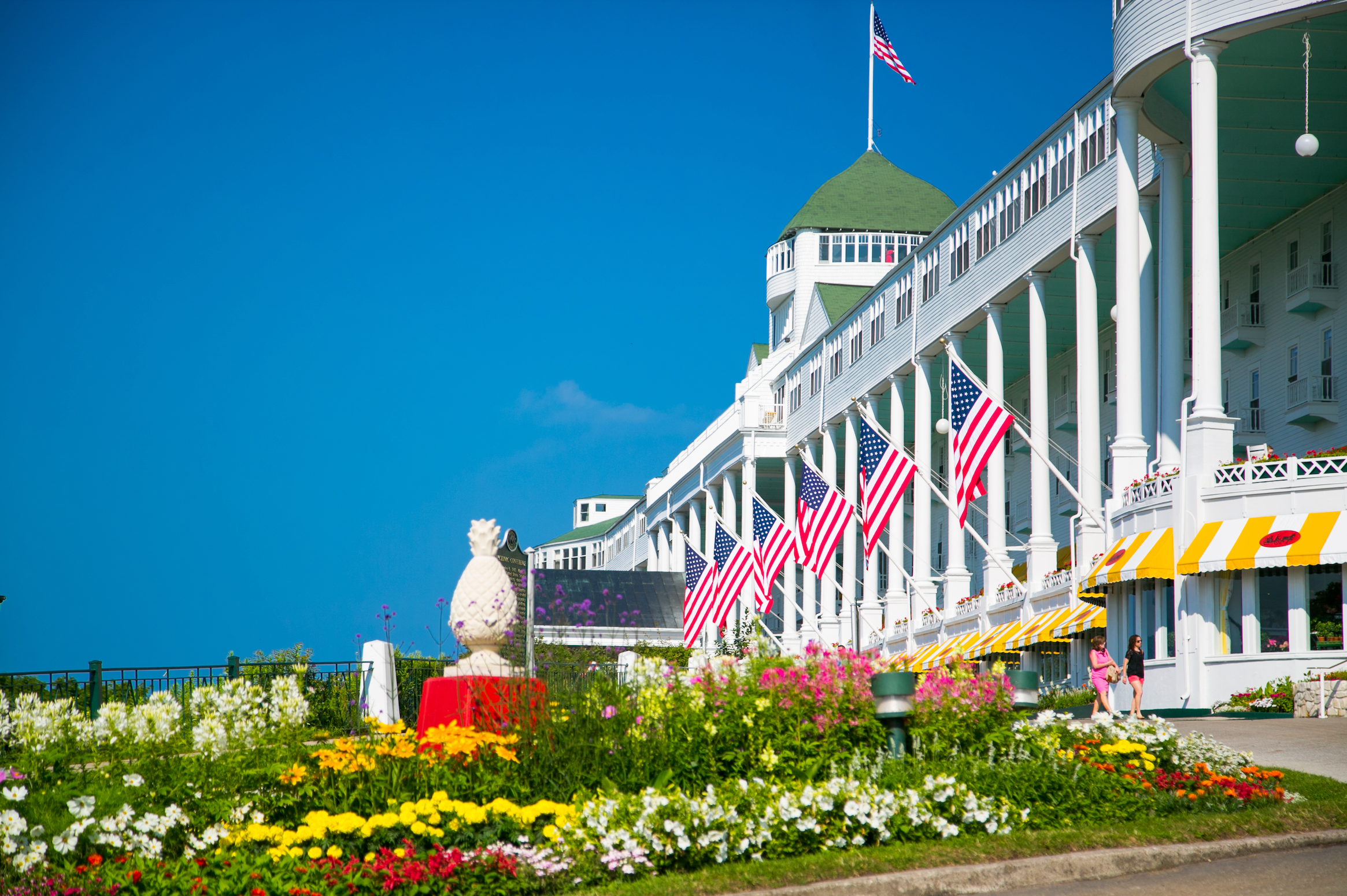
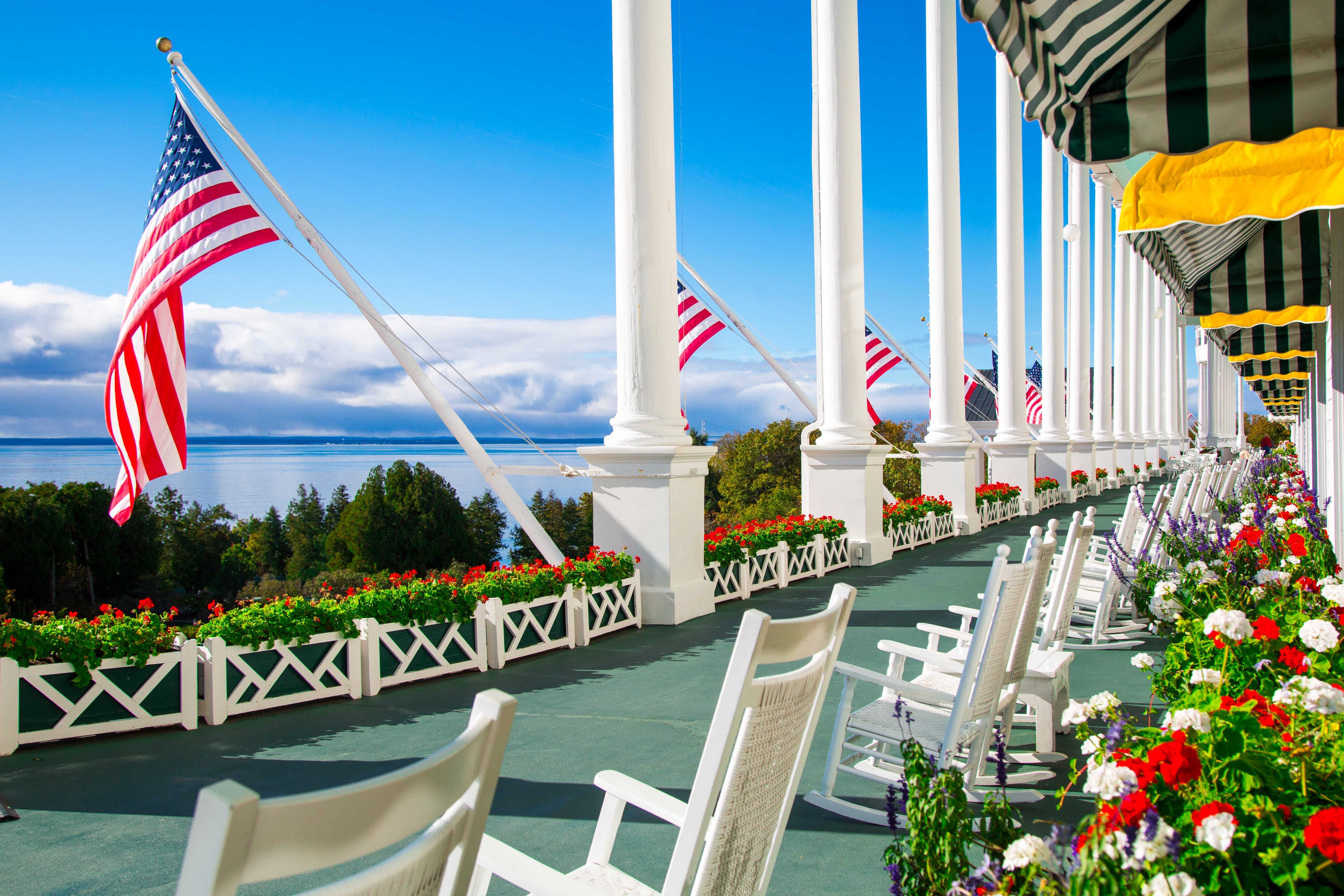
Is Carlton Varney the decorator for the Grand Hotel
on Mackinac Is., Michigan. ? We have loved the Esther
Williams suite for years. Unfortunately we cannot go to the
Grand this year because of a new knee and the
Covid Virus. We plan to get back in 2021.
The hotel is so beautifully and colorfully decorated and I
have adored it for years
Lana Rae Higgins















Fabulous article! Have always loved your decorating esp at The Greenbrier. The color coffee is on my dining room walls with glossy white trim. I have always loved color during my years as a decorator and am in love with orange as accent!
Thank you for all the inspiration you have personally given me through the years.
TerribHummel