A fearless use of color can transform a building’s look
By Carleton Varney- special to the Palm Beach Daily News.
I recall many decorating adventures in Palm Beach in which my fearless love of color played a big role.
In the 1980s, The Brazilian Court had been sold and my team of decorators and I were called in to redo the boutique hotel at the corner of Australian and Hibiscus avenues.
I knew the hotel, of course, and saw it could use a dose of bright color, so that was starting point for the redesign. The Gaucho Bar was still in operation and I wanted to transform it into a space that would greet guests as a garden of happiness.
But the most important element of the overall project, I believed, was this: The white exterior needed a change of color.
Now, a color change can be a difficult subject to broach with property owners. They often push back when someone suggests changing the color or architecture of the exterior.
Changing paint colors also is not an easy task in the Palm Beach of today, where those decisions must be approved by either architectural or landmarks commissioners.
But in our case at The Brazilian Court, we were able to transform that dull white building into a sunshine-yellow building. It made such a difference!
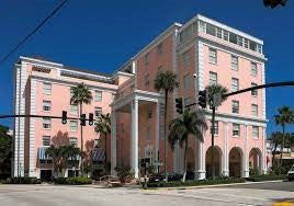
I executed a similar color transformation at The Colony several years ago, when my office and I won approval to have the iconic hotel building painted a shimmering salmon color.
With their new coats, the two hotels were perfect examples of my belief that buildings should express warmth through color. To me, gray and beige buildings look institutional and unhappy.
But the key to success is not to just pick a bright color at random. An important part also is the look that you want to achieve. I wanted these Palm Beach hotels to reflect the natural beauty that was all around them — the gardens, the rainbows, the sunshine, the sea, the sky and the tropical birds.
Achieving that goal, to me, meant choosing yellow and pink.
Yet so many of the world’s hotels have what I would call nondescript exteriors — or more accurately, exteriors of gray, white or beige.
And I have no doubt that contemporary-style buildings can withstand color. It may not always be easy to incorporate, with all the stainless steel and glass, but it can be achieved.
I believe color can charm, excite and soothe, no matter how modern and high tech the world gets.
That is color’s magical power, and it should never be ignored or forgotten.
1 comment
















May your Carlton Varney color theory live on forever! Thank you for colorizing our lives! 🌴